
Illustrative Work
Illustrative Work
Due to my Japanese background, I am largely inspired by the culture and traditions and often incorporate these into my illustrations.
Below are some of my previous works, both commissioned by others and for personal use.
All work is drawn and coloured digitally using Adobe Photoshop, Illustrator or Procreate.
Evercore Heroes (Project-V) - Hero Roster

Overview
The project involved designing the game’s Hero Roster screen in order to improve the user experience as well as the overall look and feel of this screen. In an early version of Evercore Heroes (then called “Project-V”), the out-of-game experience consisted merely of a server selection screen and a very basic lobby screen that allowed players to flick through heroes and read details about them or their abilities.
In creating a Hero Roster screen outside of a match, players would be able to learn about heroes without the pressure of only being able to learn about them once in a team. Down the line, this screen would eventually allow for the expansion to other screens and functionalities also, such as the unlocking of heroes, equipping of skins and other forms of personalisation (e.g. emote wheel).

My Role
UX researcher, UX designer,
UI designer, Implementer

Tools Used
Adobe XD
Illustrator
Photoshop
Miro
Unreal Engine 5
Process

Research
Competitive Benchmarking
Before designing this screen, I wanted to gain insight into what competitor games are doing and see what layouts or design patterns they use. In addition, I wanted to maintain familiarity between the screen design and players so that they are not faced with a non-conventional or overly creative screen that is difficult to interact with.
A variety of hero roster screens were examined from both games of the same genre as Evercore Heroes and games of other genres. These game screens were selected for research as they resembled the vision I and other product owners had for Evercore Heroes.
As a result of this research, I was able to find out what solutions worked for players and what I should avoid or improve.


(Click to enlarge gallery)
Some key insights
-
Allowing players to select a character using a portrait (as opposed to just text) allows for easier recognition by players. The use of grids is also quite common.
-
Some games lean towards using part of the screen to display large previews of the character.
-
Some games split their roster flow into two screens (i.e. a gallery screen that gives rise to a more detailed individual character screen)

Usability Testing (Playtesting)
Tools used: playable game created in Unreal Engine, video recording and employee feedback threads
Research also included receiving feedback from other employees at the company after daily playtesting of the game in-house. This allowed me to gather in-depth qualitative data that would later inform design decisions. This allowed me to gather a better understanding of player tendencies, what they may want from this screen and pain points of the current design that could be worked on.
Early versions of Project-V did not include a Hero Roster screen. The closest to this was the lobby scene (also later redesigned by me) which allowed players to view the different heroes.
Some key insights
“I really don’t like having to navigate between heroes using arrows, it takes forever to get to the hero I want. It’s not too bad right now because we don’t have too many, but what happens when we’ve got a much bigger roster?”
Players finding it difficult to navigate between heroes.
“I wish I could see these heroes out of game so I’m not trying to figure out hero abilities when my team is waiting on me to ready up”
Players experiencing pressure to understand hero details under time pressure.
“I hate that I don’t know what role the hero is until I have them selected. It’s confusing and I don’t know where to find a specific hero”
Players experiencing difficulty navigating due to poor categorisation.
Design Implications
-
Hero selection should be in the form of portraits and laid out so that players can navigate through them easily (e.g. in a grid as opposed to a carousel)
-
Information should be categorised for easier navigation (e.g. heroes may be grouped into archetypes)
Analysis
Affinity Diagram
Tools used: Miro
Identifying user goals, behaviours and pain points for players helped build an affinity allowed important information to be organised into themes and patterns. This also allowed for key pieces of information to be constantly visible throughout the UX process as a reminder as I tackled through each problem.
Design
Interaction Design & Low-Fidelity Mockups (Version 1.0)
Tools used: Pen & Paper, Adobe XD
With research and analysis complete, I proceeded to sketch out low-fidelity and medium-fidelity mockups of the hero roster screen while exploring different layouts and user flows. This allowed me to come up with solutions for the above problems and test different approaches quickly, as well as refine them during the visual design phase and flesh out any ideas.
The layouts were discussed with product owners and other employees at the company and a direction was decided on before recreating them in colour with higher fidelity and readying assets for initial implementation and testing in Unreal Engine.
2D animations and sounds were also added to give the screen that extra touch.


(Click to enlarge gallery)
First implementation of the Hero Roster screen in Unreal Engine (Click to enlarge gallery)


Iteration
High-Fidelity Design and Implementation
Tools used: Adobe XD & Unreal Engine
Constant feedback from both players within the company and outside on the hero roster screen has allowed for improvements and iterations to the above design. Such iterations were also made in response to a major change in the game’s visual style leading to the current design of the game's hero roster screen.
High-fidelity mockups of the new hero roster flow


Implementation of new layout in Unreal Engine


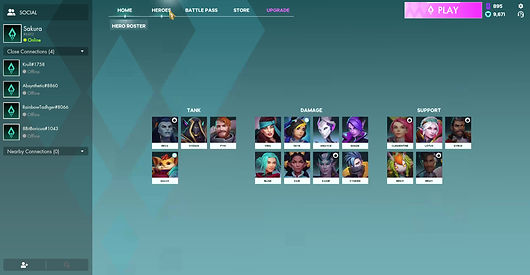
Current state of hero roster flow in Evercore Heroes in action
Some of the solutions made:
Between the initial and the latest versions of the hero roster screen, I made a number of changes based on feedback, changes to the visual style guide, increasing roster size and additional functionality requirements.
-
The initial one-screen fits all approach no longer worked with the increasing size of the hero roster and so, the grid was moved from being on an expandable tab to a screen on it’s own. The hero roster screen now composes of a two-screen flow where by players click on a portrait and enter a hero details screen and can return by hitting the esc key/clicking on the on-screen button.. Not only did this change allow the screen to feel less cluttered and better match the cleaner and more open style of the game, but it also had a positive knock-on effect whereby players were no longer bombarded with too much information as soon as they entered the hero roster flow (which was noted frequently in feedback with the previous design). This information is now broken down into stages to reduce cognitive overload.
-
With additional customisation options being added to the game, it became apparent that surfacing all pieces of information was no longer a viable option nor was some of this information required to be surfaced at all times. For example, previously, “hero talents” (a feature where players can equip various talents from a talent tree to build their heroes in desirable ways) were displayed at surface level. With additional functionality being added to this screen (e.g. other forms of customisation), the hierarchy of information of this screen was revisited. Key pieces of information were left on-screen (e.g. hero name, information on skills and skin thumbnails) and secondary information (e.g. the talent icons) was moved into buttons where players can access this information with one click, again reducing cognitive overload.
Learnings & Takeaways
-
Hiding and revealing certain features and UI elements until a player reaches a certain level is a good approach that ensures that the player isn’t overwhelmed by the amount of information presented to them at once.
-
Keeping the number of interactions as low as possible is important, however, some creative liberties can be taken if it improves the overall flow, accessibility, clarity and reduction of cognitive overload.
-
The addition of future content needs to be kept in mind when designing UI since, within a short period of time, a large set of features may be introduced and findings ways to implement them require dramatic changes to the UX and UI if not planned in advance (the above changes all occurred within months).
Evercore Heroes 2024 © Vela Games. All rights reserved.