
Illustrative Work
Illustrative Work
Due to my Japanese background, I am largely inspired by the culture and traditions and often incorporate these into my illustrations.
Below are some of my previous works, both commissioned by others and for personal use.
All work is drawn and coloured digitally using Adobe Photoshop, Illustrator or Procreate.
UX case study - Restaurant Website

Overview
I was approached by the head chef/owner of an upcoming Japanese restaurant based in Ireland to design and develop a web application for guests to peruse the menu and book tables.
The restaurant itself is still in its early stages. As such, designing a website required starting from scratch with little brand details. It was also important to note that, since the website would potentially provide the first impression to new customers, it was paramount to optimise the platform so that it showcases the restaurant’s story, overall image and ambience, as well as finite details such as contact details and access.

My Role
UX researcher, UX designer
(solo project)
Time Frame
2 weeks

Tools Used
Adobe XD
Figma
Screenflow
Adobe Illustrator
Miro
Survey Monkey
Process

Research
Competitive Benchmarking
The first step of the process involved conducting a competitive benchmark analysis in an attempt to understand conventions adopted by competitor restaurants and to gain insight into what they do well.
I looked at a mix of restaurants, both direct and indirect (direct being they serve Japanese cuisine and indirect being they serve something other than Japanese cuisine). These restaurant websites were chosen based on what the owner visions for his own restaurant (they are similar to what he hopes his own restaurant would be).
Researching what these restaurants do well allowed me to identify strengths that could be emulated in the current project and address common issues.


Some key insights
-
Including a large range of images provides the user with an idea of the restaurant and the food it serves.
-
Contact details, an address and operating hours should be provided upfront without the user having to search through several pages.
-
A button for reservations should be given importance.
-
Buttons or regular text should have enough contrast against the background.

User Survey
Tools used: SurveyMonkey
Conducting a user survey allowed me to understand the specific goals of individuals who use restaurant websites. The survey was composed of a mix of open- and closed-ended and multiple choice questions and was built to take less than three minutes to complete. It was completed by 52 respondents.
Some key insights
27%
Experienced difficulty finding specific content, including a reservation page, operating hours, location.
17%
Thought they had booked a table through an email form. They thought that by submitting a form they were reserving a table when, in fact, they had to wait for the restaurant management to reply to them.
6%
Booked the wrong restaurant where the restaurant had numerous branches due to lack of proper separation.
6%
Misunderstood menu pricing due to poor menu placement.
Usability Testing
Tools used: Screenflow
In order to gain deeper contextual insight into how competitor restaurants solved the same problem, I then carried out an interview and remote usability test.
During each test, the user was required to carry out a number of tasks using three different restaurant websites. This included finding the restaurant’s operating hours, reserving a table for two people, and finding the price of a particular dish.


Some key insights
“I had to call the restaurant right after making a reservation because I didn’t get any confirmation”
Users losing confidence in the website due to issues when booking.
“It took me forever to find the restaurant’s phone number. Finally found it on the homepage but I couldn’t see it because it didn’t stand out enough”
Users not being able to find important pieces of information.
“Wait…what page am I on? Is this a contact page or a booking form?”
Users having difficulty navigating through the website.
-
Users generally choose restaurants that have a pre-established good reputation when deciding where to dine.
-
Users showed a strong dislike for scrolling through long menus or downloading a separate PDF to view the menu.
-
Users will sometimes use reviewing sites, such as Tripadvisor, and search for a restaurant to dine at through this. They will then go to the restaurant's website from here.
-
In the case of allergies or specific dietary requirements, users dislike having to call the restaurant to check what dishes contain particular allergens.
Design Implications
-
Feedback should be given immediately upon submitting reservation details.
-
Key details, such as contact details, should be provided clearly and upfront.
-
Menus should not be separate downloadable files and should be easy to read to reduce misunderstandings. They should also contain allergen information as required by the Food Safety Authority of Ireland.
Analysis
Affinity Diagram
Tools used: Miro
The next step of the process involved analysing all the data gathered during the research block.
With the assistance of a collaborator, all the data was reviewed and notes were written down on Post-It notes. Notes were made based on user goals, behaviours, pain points, mental models and contextual information.
These notes were then clustered into common ideas and categorised into different themes.


(Click to enlarge affinity diagram)
I interpreted insights to determine user needs based on groupings with the most consensus:
Insights
-
There is a preference for a clear and easy-to-read horizontal navigation bar over other forms of navigation (e.g. burger menu).
-
There is a strong like for images to showcase dishes and the restaurant’s interior.
-
Users liked sting a distinct and easy-to-access booking option or button.
-
Users have had poor experiences booking tables online.
-
Strong preference for key restaurant information (e.g. contact details, address and opening hours) upfront.
-
Users dislike menus that are difficult to read or need to be downloaded as a PDF.
-
User needs to be able to navigate through the website with ease.
-
User needs to get an idea of the food served and the ambience of the restaurant.
-
User needs to be able to reserve a table efficiently.
-
User needs confirmation of reserving a table as soon as booking details are submitted.
-
User needs to be able to find key restaurant information easily.
-
User needs a clear and easy-to-understand menu.
User Needs
Design
Flow Diagram
Tools used: Figma
With the research and analysis phases complete, the next step involved using the findings to define a high level flow for the following tasks:
-
Reserve a table for 2 for any date and at any time.
-
Find a particular food item on the menu and its price.
-
Find the opening hours of the restaurant.
This process allowed me to empathise with the user by requiring me to recognise their perspective. These user flows also helped to flesh out different elements the user may interact with as well as the different paths they could take to accomplish the tasks.


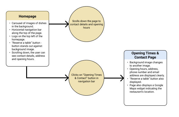
(Click to enlarge user flow diagrams)


Interaction Design
Tools used: markers & paper
With the user flow diagrams complete, I proceeded to sketch out (low-fidelity) the main screen states while defining how each element would respond to the user interacting with it.
This allowed me to complete ideas quickly and explore solutions to the issues highlighted in my research.
(Click to enlarge sketches)
Medium-Fidelity Prototype
Tools used: Adobe XD
Using my sketches as reference, I proceeded to create an interactive medium-fidelity prototype using Adobe XD.
I opted for a medium-fidelity prototype as the design doesn’t incorporate many detailed areas or forms that require a high-fidelity version. A medium-fidelity prototype also allowed me to spend more time finding a solution that meets all the requirements based on my research and less time on refining fine details of the design. The reduced colour palette also meant I could pay more attention to the architecture of each screen which would in turn allow me to assess any usability issues prior to deciding specific details.
Here, I have generated a prototype to test the homepage, reservation, menu and opening times/contact pages.


Wireframes
Tools used: Adobe XD
The final step of the project was to make it ready for handing over to the development team. This required creating a detailed set of wireframes, annotating every unique interaction within the prototype with notes of how the elements should behave. The objective was to remove any ambiguity by clearly directing the development team how the website works.
Some kind words from the client:
"Sakura has been working remotely with me on my company’s website and it has been an absolute pleasure working with her. She is extremely patient and considerate, always willing to listen to my input. She is highly organised in everything she does and very intuitive in her design work. I couldn’t recommend working with her enough!"
Learnings & Takeaways
This project gave me the opportunity to better understand how research refines decision-making to create valuable designs. It was my first project upon completing my Diploma in UX Design and allowed me to further practice the skills I learned during the course. In addition, I learned to evaluate solutions within a set budget, timeline and specific client requests, providing a more “real-world” experience of the process.