
Illustrative Work
Illustrative Work
Due to my Japanese background, I am largely inspired by the culture and traditions and often incorporate these into my illustrations.
Below are some of my previous works, both commissioned by others and for personal use.
All work is drawn and coloured digitally using Adobe Photoshop, Illustrator or Procreate.
UX Diploma - Airline Booking Experience

Overview
As part of my Professional Diploma in UX Design from the UX Design Institute, I was required to carry out a case study and design a desktop website for a fictional start-up airline company. The task required me to create an online experience that is fast, easy and intuitive with a particular focus on the booking process.
In carrying out this project, I have had the opportunity to undertake a full-scale UX project and practice all theory learned throughout the course as well as exercise a range of research techniques.

My Role
UX researcher, UX designer
(solo project)
Time Frame
12 weeks

Tools Used
Adobe XD
Figma
Invision
Camtasia
Adobe Photoshop
Adobe Illustrator
Miro
Survey Monkey
Process
The project provided me with the opportunity to engage in the full UX design process. This meant following different research methods to identify existing challenges faced by users, sketching ideas that solved such issues and designing a prototype.

Research
Competitive Benchmarking
As a first step, I conducted a competitive benchmark analysis in order to gain a clearer idea of the conventions adopted by competitors. I wanted to assess how they deliver excellent user experience as well as identify issues that may cause friction.
I narrowed down my search to three European airlines: KLM Royal Dutch Airlines, Aer Lingus and Ryanair.
This exercise allowed me to uncover best practices and which conventions I should reproduce in my own prototype.


User Survey
Tools used: SurveyMonkey
Carrying out an online user survey provided insight into the specific goals of people who use airline websites to book flights. I used a mixture of open- and closed-ended questions as well as some multiple choice questions. The survey would take less than three minutes for people to complete. It was completed by 38 participants. The data gathered from this survey allowed me to make more informed design decisions later in the case study.
Usability Testing
Tools used: Camtasia
In order to gain more contextual insight into how well or badly different organisations solved the same problem, I carried out an interview and moderated usability test in which the user was required to book a flight using the KLM and Ryanair websites. I was also provided with two additional usability test recordings by the client.
My goals were to learn about the context of use of people who book flights using airline websites, as well as determine their goals and behaviours.


ANALYSIS
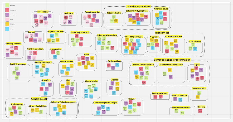
Affinity Diagram
Tools used: Miro
The next step involved making sense of all the data gathered.
A collaborator and I reviewed data gathered from the research phase and made notes relating to user goals, behaviours, pain points, mental models and contextual information. Points were written up on virtual Post-Its using Miro and were then organised into patterns and themes that made sense.


Customer Journey Map
Tools used: Pencil & paper, Figma
Taking the information from the affinity diagram, I then organised this into a step-by-step view of the users’ experiences through the flight booking process. Their goals, behaviours, contexts and pain points at each step were also noted.
The customer journey map allowed me to look at comprehensive groups of issues within the booking process and provided an insight into the process through the user’s eyes.

DESIGN
Flow Diagram
Tool used: Pencil & paper, Figma
With the research and analysis phases complete, it was now time for me to make informed decisions and sketch the main screen states. I used the findings from the previous phases to define a high level flow from the Homepage to the Payment Page of the website.
Carrying out this task allowed me to translate my ideas to paper and I was able to address the issues that were uncovered through my research. I then took these sketches and recreated them digitally.
Click here for close-ups of the flow diagram


Interaction Design
Tools used: markers & paper
After finalising the main flow, I proceeded to sketch the main screen states, defining how each element would function and how the user would interact with them. The process of sketching quickly allowed me fully explore solutions to problems that I discovered in my analysis.
Some of the solutions made:
My research indicated that the primary use case for airline websites is booking flights, so this function should be given highest importance in terms of the location of the homepage. I also designed the homepage to be as uncluttered and scannable as possible by removing all distractions (for example, search options deemed unnecessary at this stage, such as car hire). This way the user would feel less overwhelmed and more in control of the booking process.
Analysis of the research also indicated a preference for selecting options as opposed to typing into fields as users feel they can be more accurate and less likely to make an error. While still allowing the option to type, I opted to provide drop-down lists or a calendar when a field is clicked on to allow for easy selection.
From my research, I found that bag selection was an area of consistent confusion and that adding additional luggage was a reoccurring user requirement that presented itself. A design choice I made to address this issue was to include an “Optional Extras” page so that the user may make adjustments to one or both flights.
Medium-Fidelity Prototype
Tools used: Adobe XD
After sketching out each screen state, I continued to re-create my design in Adobe XD. I opted for a medium-fidelity prototype as there weren’t many forms or detailed areas that required creating a high-fidelity prototype. This also meant that I would be be able to spend my time more efficiently on creating, testing and iterating the prototype, and less so on refining details of the interface.
While a reduced colour palette allowed me to focus more on the architecture and structure of the screens, still having a decent level of details within the prototype meant that users would be able to navigate through the flow during testing as they would on a live website.
"It was intuitive and simple to use, well done. It's clear to see the solutions already defined in the flow diagram and interaction design have been depicted here". - UX Design Institute

Wireframing
Tools used: Adobe XD
The final step of the process required detailed descriptions, rules and actions that defined the interactions into wireframes. This was necessary to prevent any misunderstandings and to share necessary guidance for the developer, meaning no guesswork and leaving nothing to chance!
Click here to view the full wireframe document
Learnings & Takeaways
It was extremely satisfying to see all my work pay off. Over the course of the project I acquired many new skills and became accustomed to new software systems such as Figma and Adobe XD.
While I have previous experience in conducting behavioural tests and research, I found that conducting usability tests in this setting very fruitful and feel confident in carrying out and analysing future tests.
I also very much enjoyed the collaborative nature of the UX process. Working with team members and users meant working together towards a common goal. Furthermore, gaining insight into real user behaviour allowed me to build empathy towards the user while also tapping into my background in Psychology.
I look forward to using the valuable skills and knowledge I have taken from this project in the future.